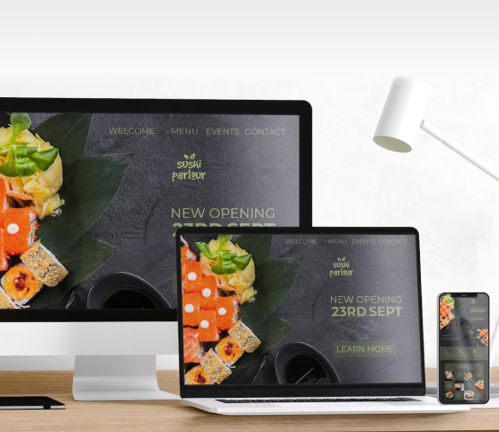

In online design, everything is always changing. There’s only one thing that never changes – this is responsiveness. With the advent of smartphones and tablets, laptops, and desktop computers; people are forced to use various devices when accessing the internet. And so there arose the need for adaptable web design; which turned out to be quite significant too! At Code Calibre, we know what it takes to make your website responsive or mobile-friendly as well as how important this could be in today’s multi-device world. Join us now as we take a deep dive into flexible web designing by looking at these underlying principles while exploring strategies for making them work across all screens. Dynamic Layouts: A responsive web design depends upon flexible contents that can adjust themselves according to the screen space. Code Calibre supports the idea of a fluid layout strategy where it uses relative units like percentages, ems, and rems so that everything scales properly on all devices. If we adopt this method, our sites will not only look good but also work well no matter what type of device or orientation they are viewed in.